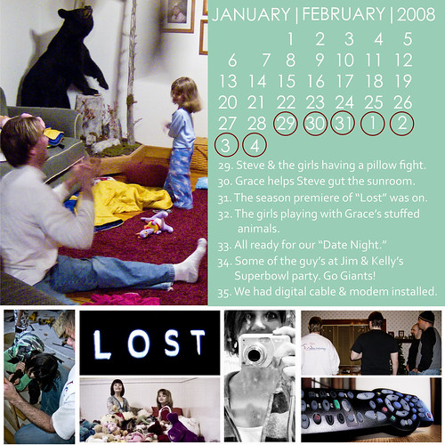
So the original template/layout I was using for my weekly Project 365 photos wasn't working for me anymore. I'm not even sure why I started to not like them, but I wanted a "cleaner" look I think. So I redid all of my weekly ones and I think I'm much happier with this format. What do you think?
I think I'll change out the color of the background with each new month, but I haven't decided for sure yet.
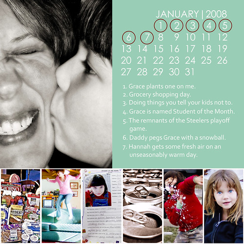
Week #1
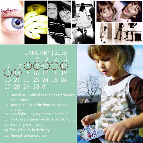
Week #2
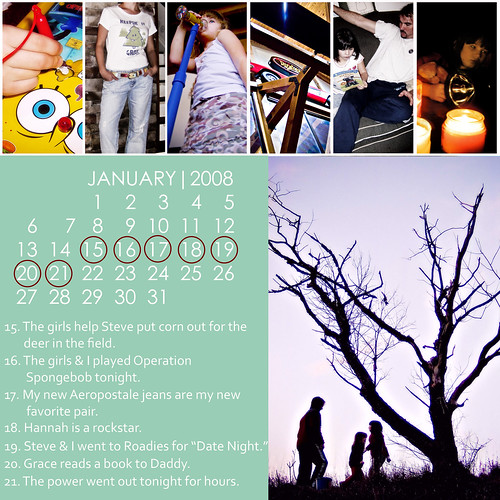
Week #3
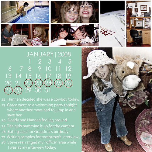
Week #4

3 comments:
Very nice! I like those a lot better.
These look great.
Good words.
Post a Comment